
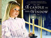
Thought I'd post the cover of my children's book. I finally got to see the finished product. They did a good job with the graphic design, but as always with reproductions the colors in the paintings turned much more golden than the originals. But I bet most people won't notice. I interned with Paul O. Zelinsky a few years ago and he was telling me there is always a huge difference once things go to print, and even showed me his Rapunzel originals which were amazingly rich. But he was right, we compared his reds to those in the book and they weren't nearly as gorgeous. Many thanks to my models Jennessa, Barry and Michelle, for all their wonderful help!
deseret book link
2 comments:
Hi Natalie! I have been finding lots of friend's blogs. I'm glad I found yours! Your work is looking so great! Congratulations on all the great work you are getting! TTYL
*Shawna
I saw Paul O. Zelinsky's work at the NCCL in Abilene, Texas. Wonderful! I've loved seeing all these talented artists like yourself and Maryn Roos on various blogs. When the work is done digitally, you don't lose as much of the original color depth as you do when it goes to print.
I love your work.
Post a Comment